Enhanced Navigation > Seamless Rentals > Simplifying Listings > Transforming Onboarding
Seamless Rentals: Making the Clothes Rental Experience Effortless and Enjoyable
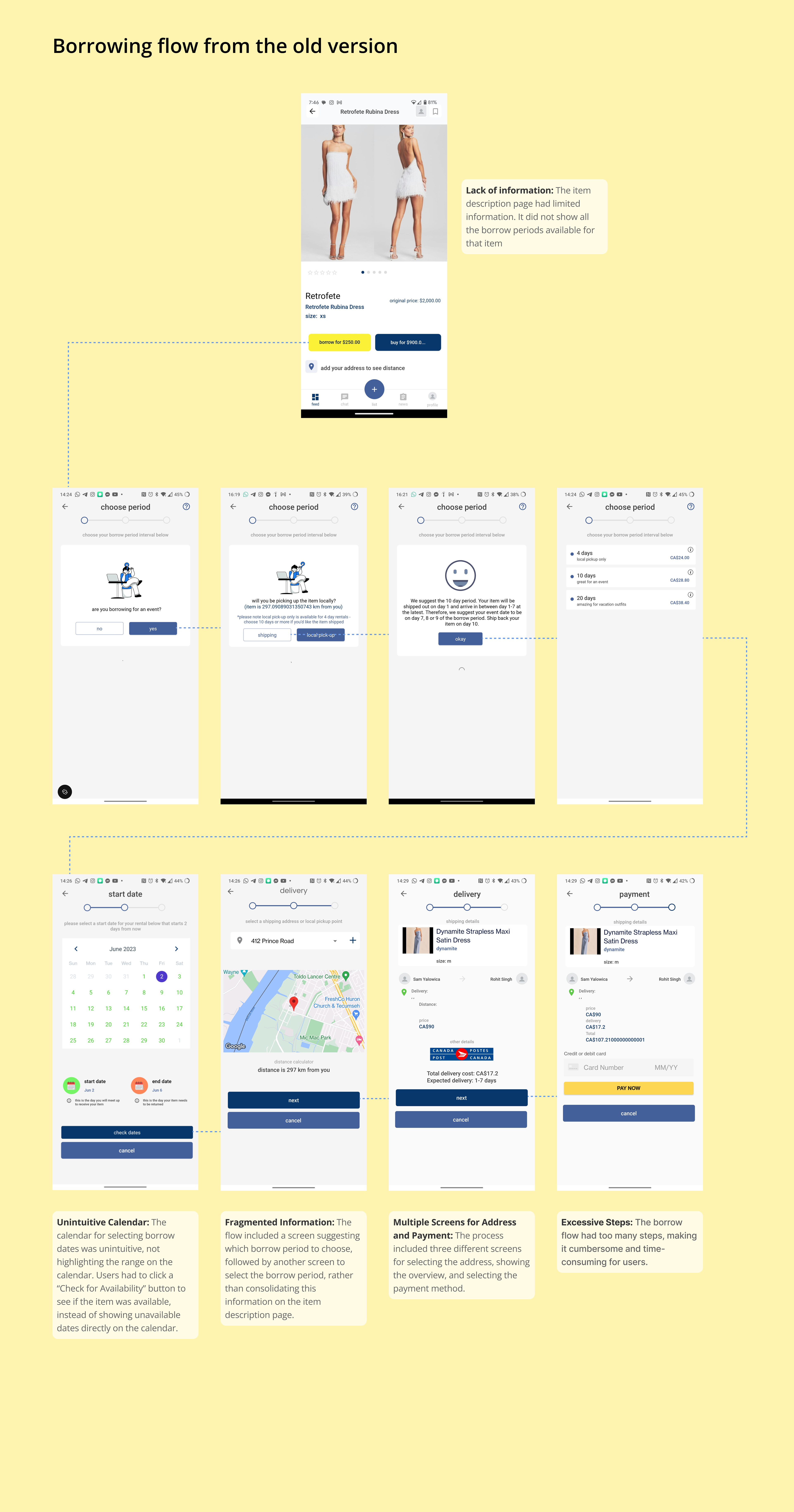
PROBLEM STATEMENT
The existing borrowing process was cumbersome and incomplete, with the item description page lacking all available borrow period options and too many steps required to complete a transaction, leading to user frustration. How might we streamline the borrowing process to display all available options clearly and reduce the number of steps, so users can easily and quickly borrow items?
Let's zoom out a bit to understand the solution flow
Now, let's zoom in to key screens
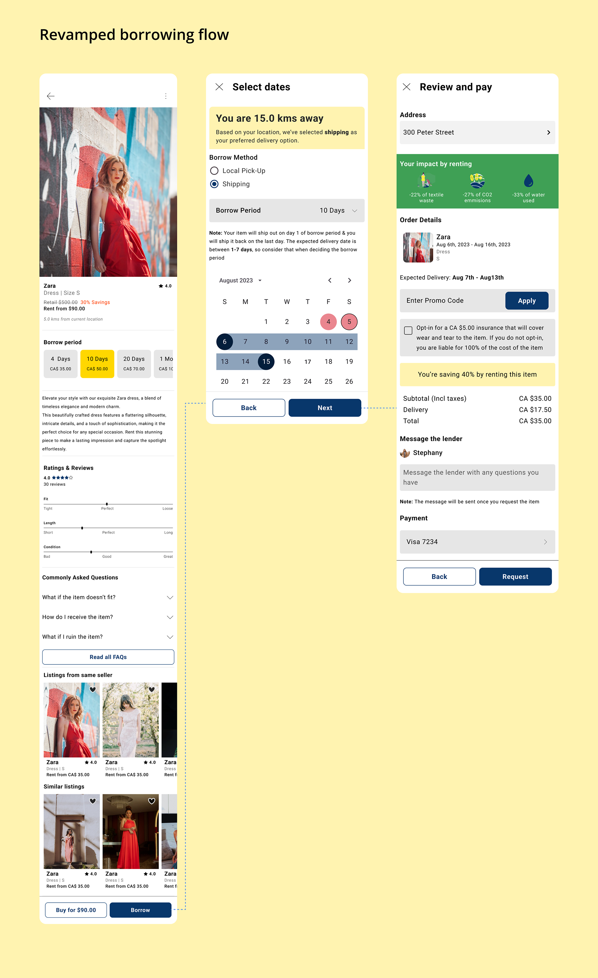
SOLUTION
Item description page
The redesigned item description page now provides a wealth of information to help borrowers make informed decisions. Key enhancements include:
1. Borrow Dates: Clearly displayed different borrow periods and their respective prices.
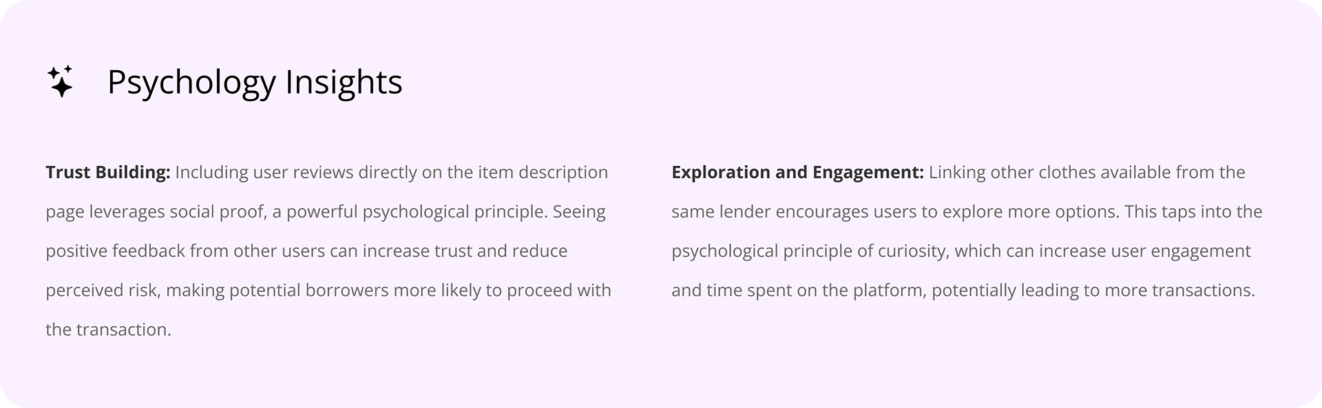
2. Reviews: Integrated user reviews to provide insights into the quality and satisfaction of previous borrowers.
Item description page
The redesigned item description page now provides a wealth of information to help borrowers make informed decisions. Key enhancements include:
1. Borrow Dates: Clearly displayed different borrow periods and their respective prices.
2. Reviews: Integrated user reviews to provide insights into the quality and satisfaction of previous borrowers.
3. Descriptions: Detailed item descriptions to give users a better understanding of what they are borrowing.
4. Linked Listings: Easy access to other clothes available from the same lender, encouraging users to explore more options. This feature not only enhances the user experience by offering a broader selection but also increases the potential for additional transactions, thereby boosting overall business revenue.


Date Selection
The redesigned date selection screen consolidates the borrow period selection and date selection into a single, streamlined interface. Key enhancements include:
1. Integrated Borrow Period and Date Selection: Users can now select the borrow period and dates on the same screen, reducing the number of steps and simplifying the process.
2. Intuitive Calendar Display: The calendar now highlights the selected date range and shows available dates directly, eliminating users needing to press a button to check availability.

Review & Pay
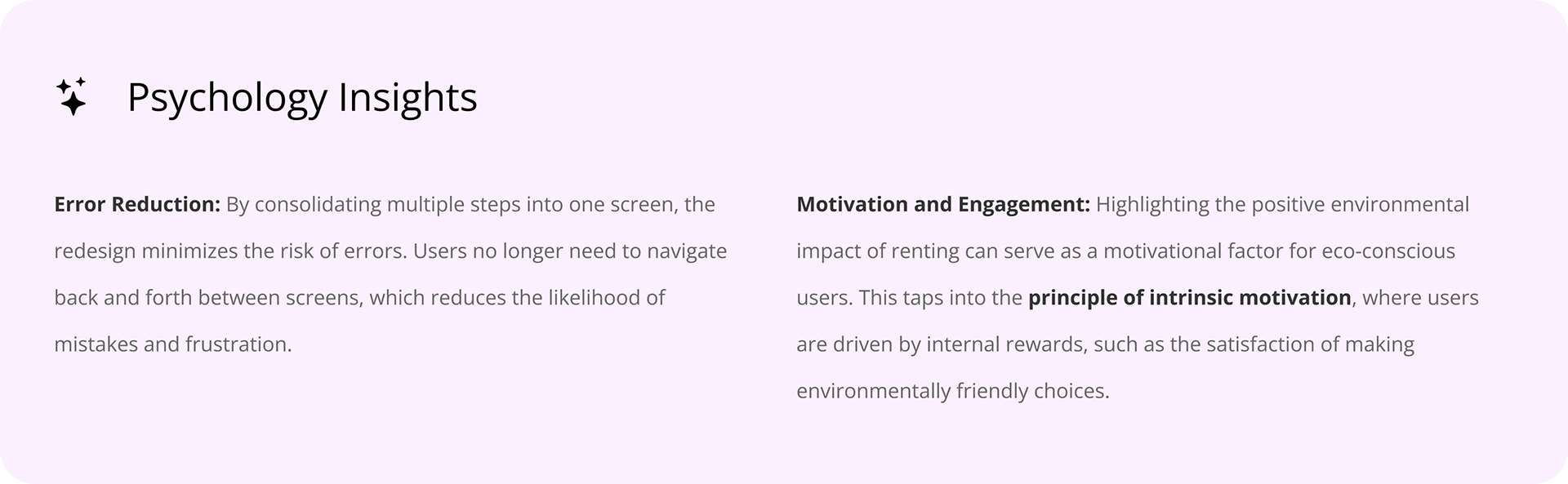
Previously, the process required users to navigate through three separate screens to select the address, view the order overview, and choose the payment method. This fragmented approach was time-consuming and could lead to user frustration and drop-offs. The redesigned Review and Pay screen consolidates the address selection, order overview, and payment method into a single, streamlined interface. Key enhancements include:
1. Consolidated Interface: Address selection, order overview, and payment method are all available on one screen, reducing the number of steps and simplifying the process.
2. Environmental Impact Information: The screen now displays the positive environmental impact of renting, which can resonate with eco-conscious users, enhance their overall experience, and increase conversion.

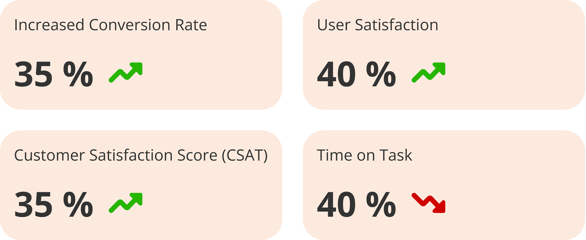
Impact: Elevating User Experience and Driving Business Growth
To validate my design decisions and measure their impact, I conducted usability testing with existing users of Rax. The results highlighted significant improvements and validated the effectiveness of the new design. Here are the key impacts: