Enhanced Navigation > Seamless Rentals > Simplifying Listings > Transforming Onboarding
Simplifying Listings: Empowering Users to Share Their Wardrobe with Ease
PROBLEM STATEMENT
The existing listing process was fragmented and confusing, with multiple pages and a lack of transparency on pricing and calculation of prices for the different borrow periods, leading to a poor user experience. How might we streamline the listing process to make it more intuitive and transparent, so users can easily add their items with clear information on pricing and borrow periods?

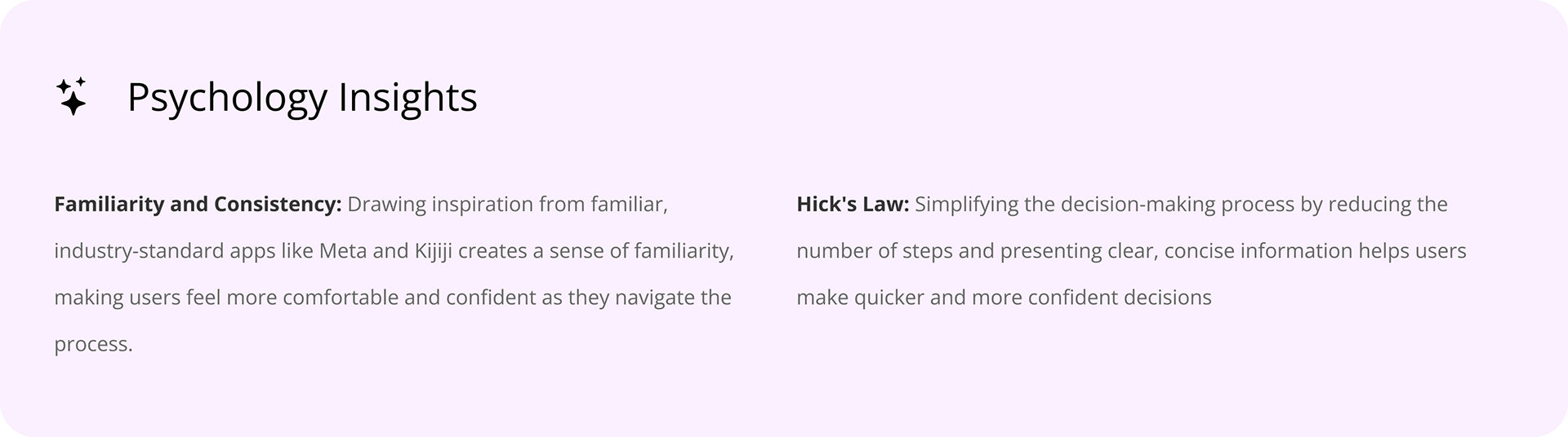
I took inspiration from industry-leading apps like Meta & Kijiji and consolidated all the information on one page, but there was still a problem that I was facing
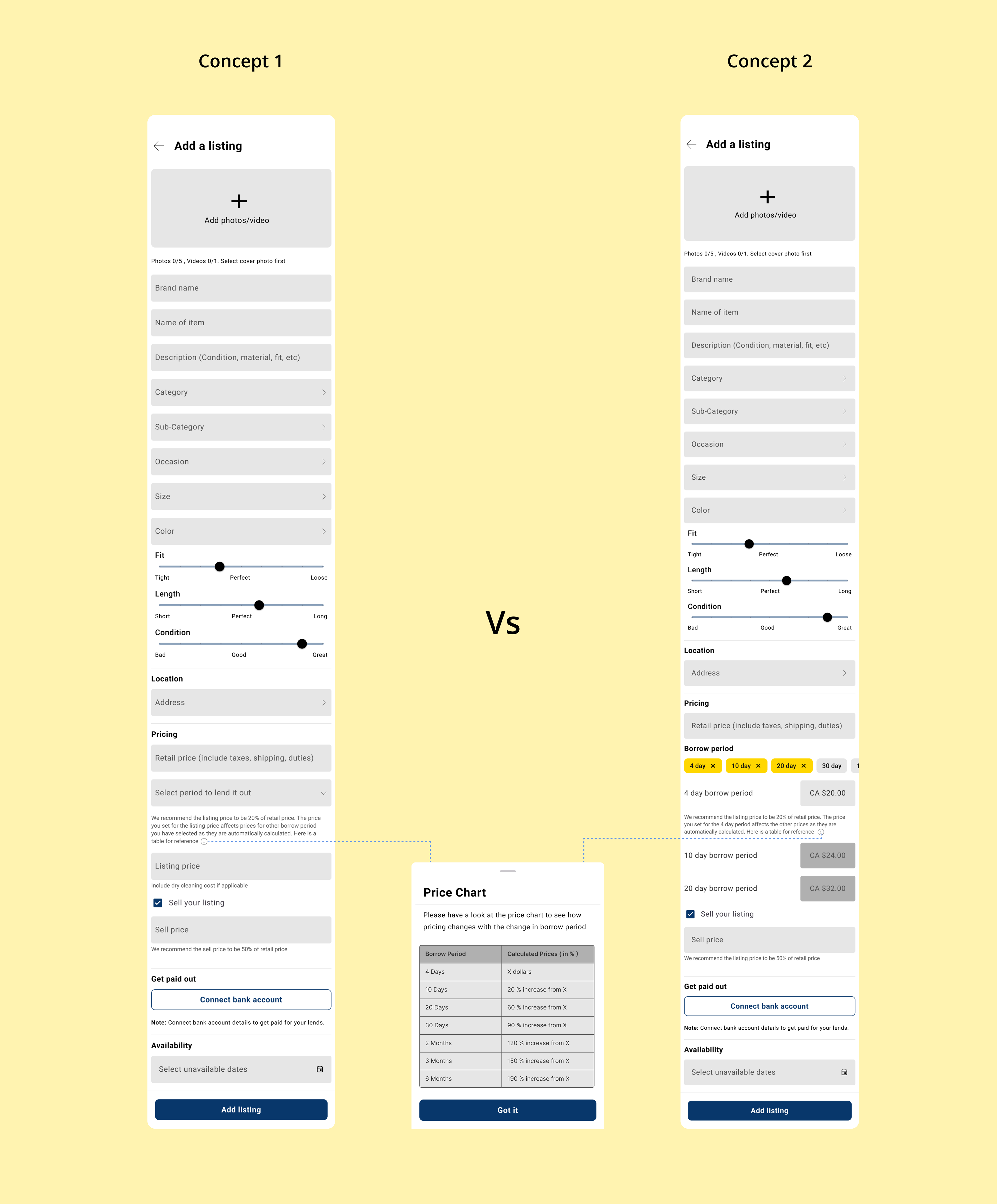
To improve transparency on how the different borrow periods are priced, I came up with two solutions. So I did A/B Testing to figure out which would be better for our users
The results of our A/B testing revealed a clear winner, but that wasn't the final solution we implemented
Concept 2
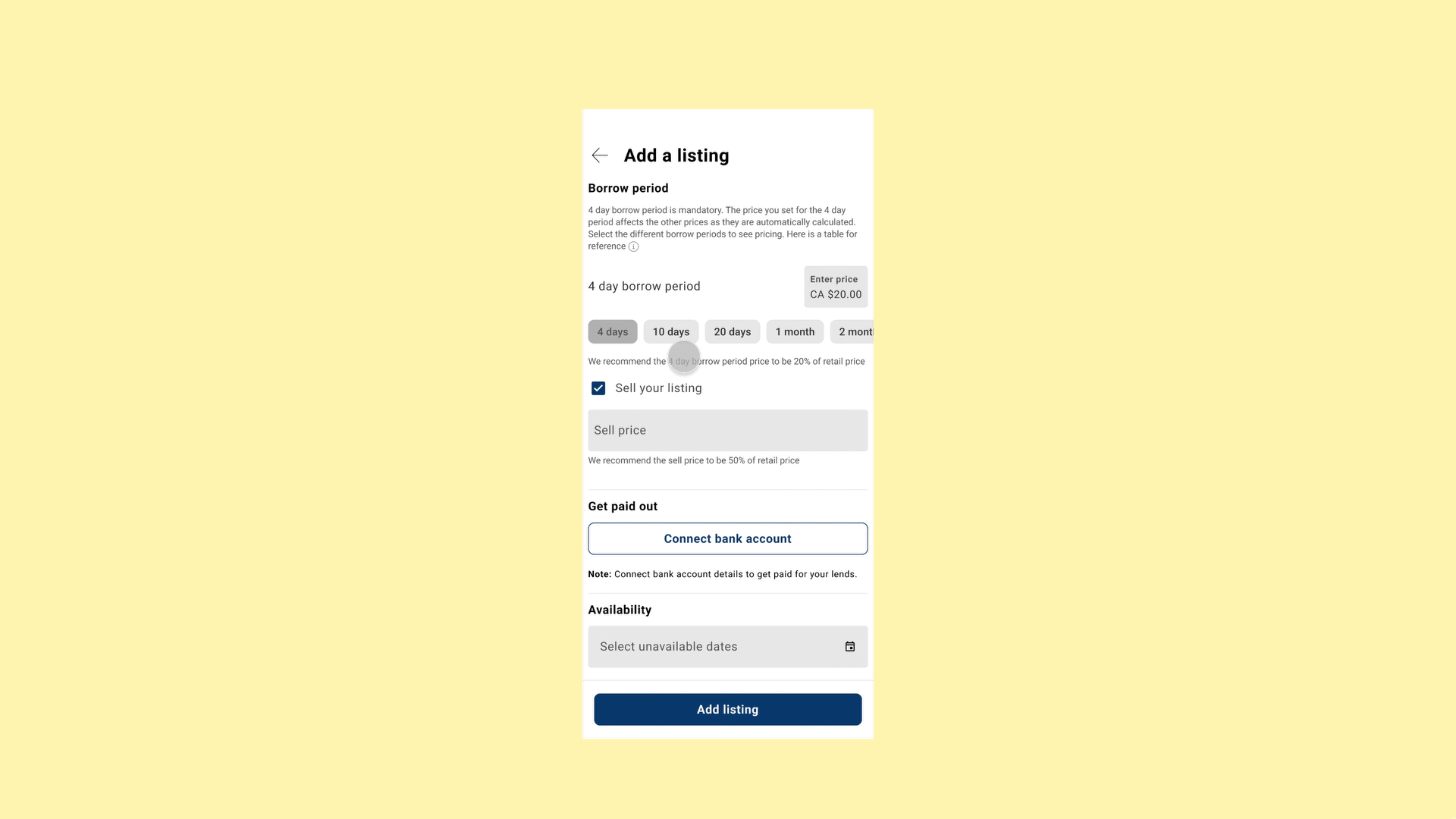
The winner for A/B test was Concept 2. Our A/B testing revealed a crucial insight: users wanted to see the calculated prices for different borrow periods. This feature was essential for them to understand their potential earnings from longer rentals.
With this valuable feedback in hand, I sat down with our CTO to discuss Concept 2, which included animations. However, given our tight timeline, the CTO suggested we needed something simpler.
With this valuable feedback in hand, I sat down with our CTO to discuss Concept 2, which included animations. However, given our tight timeline, the CTO suggested we needed something simpler.
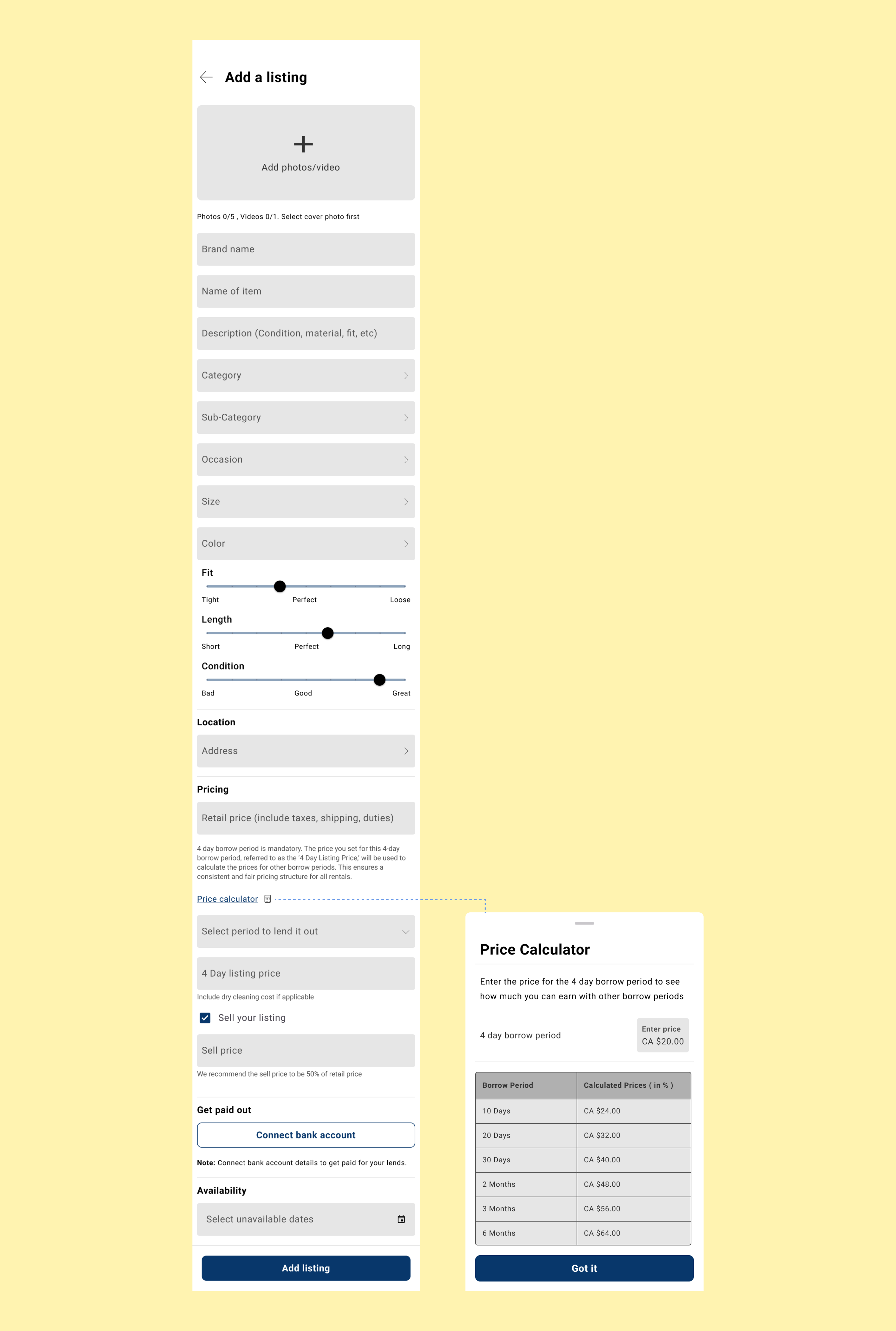
Inspired by users’ desire to see potential earnings and our need for simplicity, I merged the best features into a streamlined solution that delivered essential information without the complexities.
SOLUTION
Add Listing
The final add listing flow addressed the issues in the old flow by implementing several key improvements:
1. Single-Page Design: The new flow consolidates all steps into a single page, making the process more streamlined and efficient.
2. Modern Design Standards: The design was updated to align with current industry standards, taking inspiration from leading apps like Facebook and Kijiji.
3. Transparent Pricing: The new screen provides clear information on how borrow period prices are calculated based on the 4-day borrow period price as a base price. Adding the price calculator as a bottom sheet saved real estate on the screen and prevented it from being cluttered
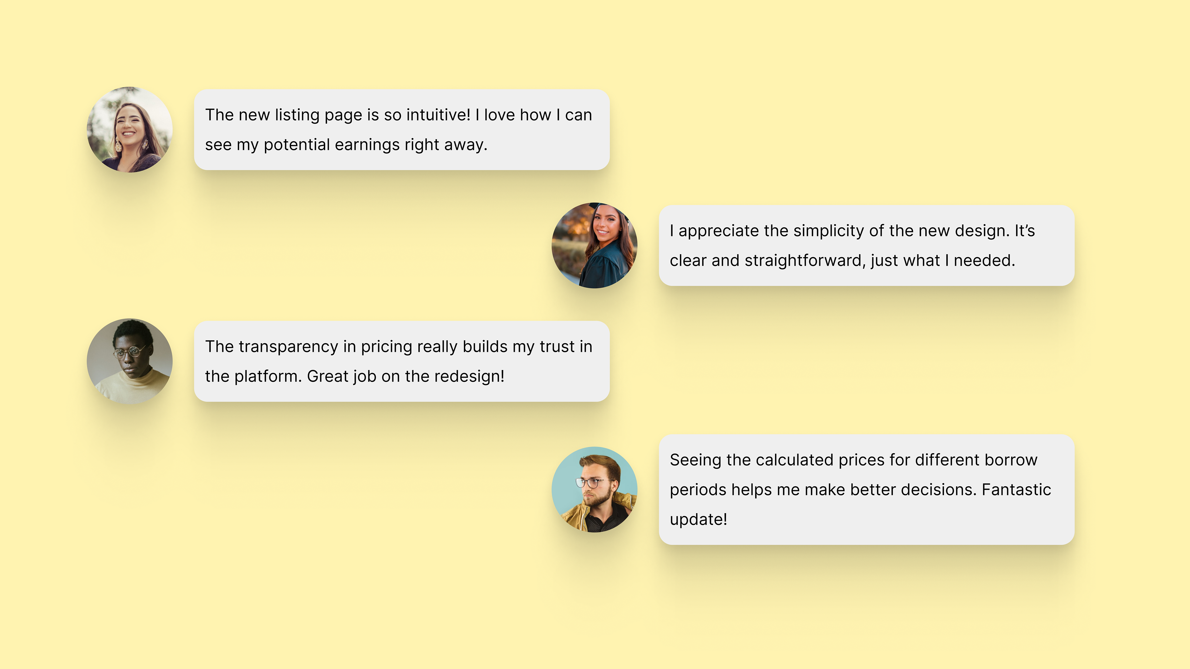
Impact: Streamlined Listing Flow Enhances User Experience
I conducted usability testing with the final design to validate my design decisions and measure their impact. The results highlighted significant improvements and validated the effectiveness of the new design. Here are some of the things the participants had to say about the redesign