INTRODUCTION
In an era where sustainability and sharing economies are becoming increasingly important, Rax, a peer-to-peer B2C clothes rental startup, is revolutionizing the way people access fashion.
Initially built as a no-code app on Adalo, Rax faced significant challenges with performance and user experience. The app was laggy, and the user flows were not intuitive, leading to frustration among users.
Recognizing the need for a complete overhaul, Rax hired me as the Product Designer to revamp the entire app. The revamp included auditing and modifying the user flows, making the designs from scratch and creating a consistent visual identity while addressing the technical nuances that come with transitioning an app from no-code to a customizable code framework.
Recognizing the need for a complete overhaul, Rax hired me as the Product Designer to revamp the entire app. The revamp included auditing and modifying the user flows, making the designs from scratch and creating a consistent visual identity while addressing the technical nuances that come with transitioning an app from no-code to a customizable code framework.
MY ROLE
Responsible for research, conceptualization, design, user testing, and delivery of MVP.
Responsible for research, conceptualization, design, user testing, and delivery of MVP.
THE TEAM
1 designer, CEO, CTO, and 2 engineers
1 designer, CEO, CTO, and 2 engineers
TIMELINE
August 2023 - June 2024
August 2023 - June 2024
TOOLS
Figma, Figjam
Figma, Figjam
Case studies of my focus areas during the redesign
Click one to jump to that page


Enhanced Navigation: A More Effective Way to Search, Filter, and Browse Items on the Homepage
Seamless Rentals: Making the Clothes Rental Experience Effortless and Enjoyable


Simplifying Listings: Empowering Users to Share Their Wardrobe with Ease
Transforming Onboarding: Elevate Your Rax Experience from the Start!
Enhanced Navigation: A More Effective Way to Search, Filter, and Browse Items on the Homepage
PROBLEM STATEMENT
The existing homepage design was cluttered and inefficient, showing only one listing at a time with prominent CTAs that took up too much space. The search functionality was inadequate, and the overall layout was crowded, leading to a poor user experience. How might we redesign the homepage to make searching, filtering, and browsing items more intuitive and efficient, so users can easily find and explore the clothing options available?

Understanding how, what, and when people search for listings
Speaking to Rax users on how they search and find items was super insightful and helped us make key decisions for our experiences. Here are the few main takeaways
Search by Profile: Users would want to search by profile because if they had a previous good experience with a lender, they might want to borrow from them again.
Advanced Filtering Options: Users would appreciate advanced filtering options to narrow down their search results based on criteria such as size, color, brand, and condition of the clothing.
Grid View for Listings: Users would like to see multiple listings displayed as a grid on the screen, so they don’t have to scroll extensively to view more options.
Advanced Filtering Options: Users would appreciate advanced filtering options to narrow down their search results based on criteria such as size, color, brand, and condition of the clothing.
Lets dive a bit deeper into the solution
SOLUTION
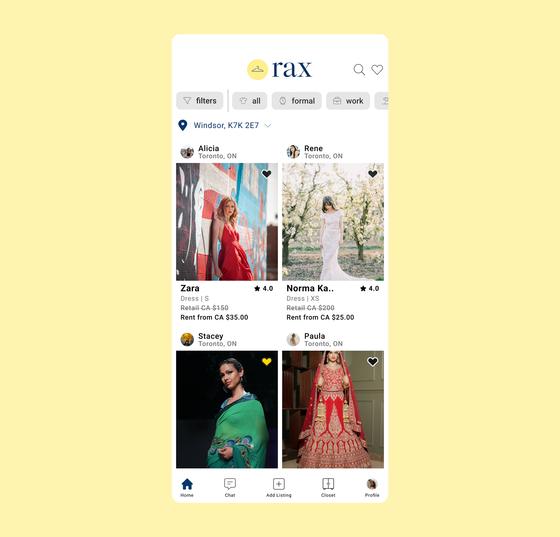
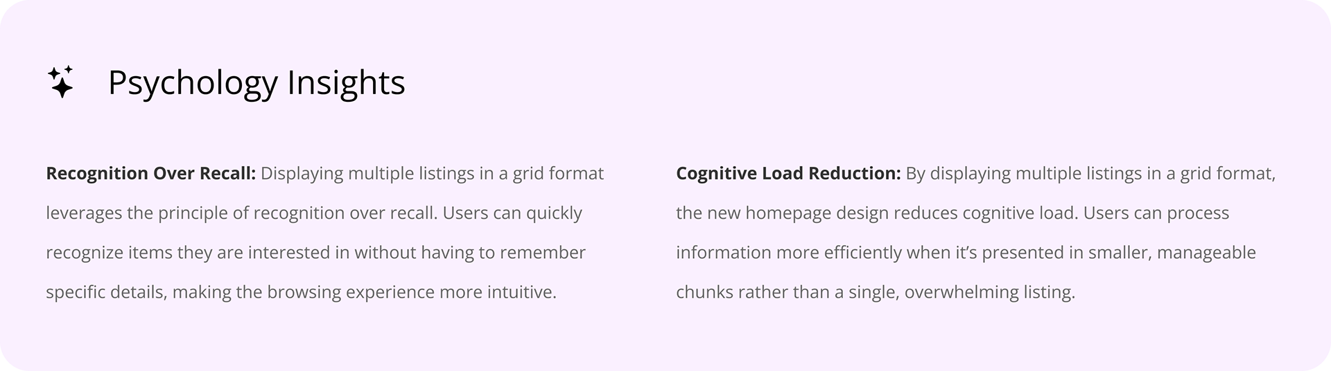
Homepage
We know from analytics that the users had more scroll depth in the old version of the homepage. That means they had to scroll more to reach the item they were looking for. This guided our decision to implement the new redesign
1. Grid Layout for Listings: The new design displays multiple listings in a grid format, allowing users to see more options at a glance and reducing the need for excessive scrolling.
2. Efficient Use of Real Estate: Quick filters are redesigned to take up less space, allowing more room for displaying additional listings.
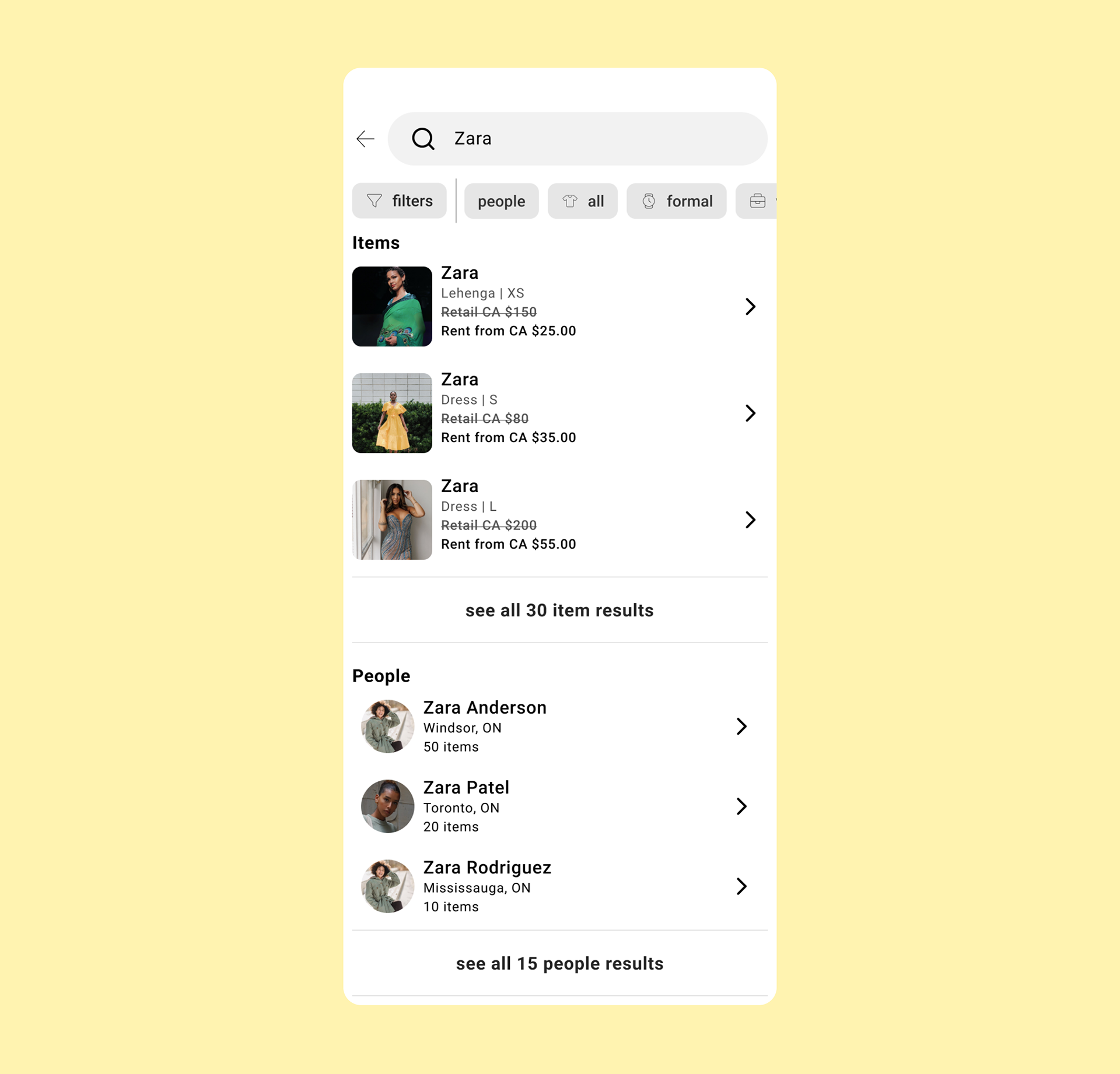
Search
We had a high bounce rate with the old search feature. Mobile also has less real estate, so to maximize the real estate and clarity, we came up with this solution
1. Compact listing cards: Instead of showing the entire listing, the new search displays smaller, more compact cards. This allows users to quickly scan through multiple results without feeling overwhelmed.
2. Segregation of Results: The search results are now clearly segregated between people and items, making it easier for users to navigate and find exactly what they are looking for.
3. Result count: The new search feature prominently displays the number of results found for each search query, providing users with a clear understanding of the available options.

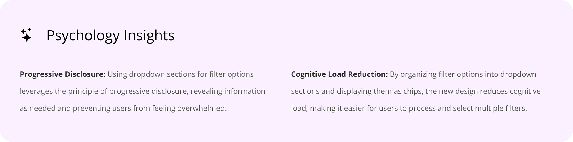
Filters
The old filter functionality was limited and confusing, offering few options, lacking feedback on the number of filtered results, and displaying a reset option prematurely. This led to a poor user experience and made it difficult for users to refine their searches effectively. Here is what we improved
1. Expanded filter options: The new filter feature offers a wider range of options, allowing users to refine their searches more precisely.
2. Result count display: The new filter functionality shows the number of listings that meet the filter conditions as users select filters, providing immediate feedback.